Sorrel Social

Strategy | Branding
Commission: Brand Strategy and Identity
When Michelin-starred chef Steve Drake launched his first coffee shop in Guildford, he partnered with us to create a brand that could stand out in a crowded market and drive growth.
Our research revealed a saturated coffee scene, but a growing appetite for independent, craft-led alternatives.
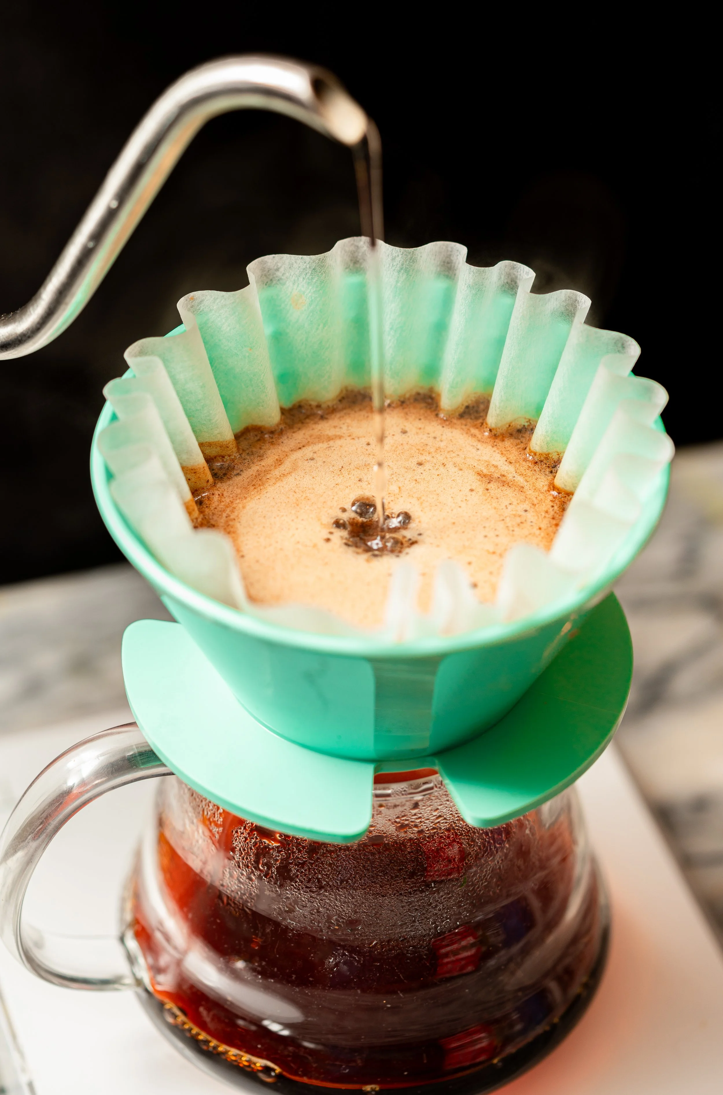
Combining Steve's reputation for precision and craftsmanship with the rise of specialist coffee culture, we built a distinctive brand rooted in expertise, quality and community.
A special thank you to Hesam Abbasi for his photography and videography.

The results
Brand Strategy
We defined three clear brand pillars: Coffee Experts. Social. Steve Drake. Together, they created a distinctive position in a crowded market, combining specialist coffee credentials, a strong sense of connection and the reputation of one of Surrey's most respected chefs.
The name Sorrel Social leveraged the credibility of Sorrel, Steve's Michelin-starred restaurant, while signalling a more relaxed, community-driven experience.
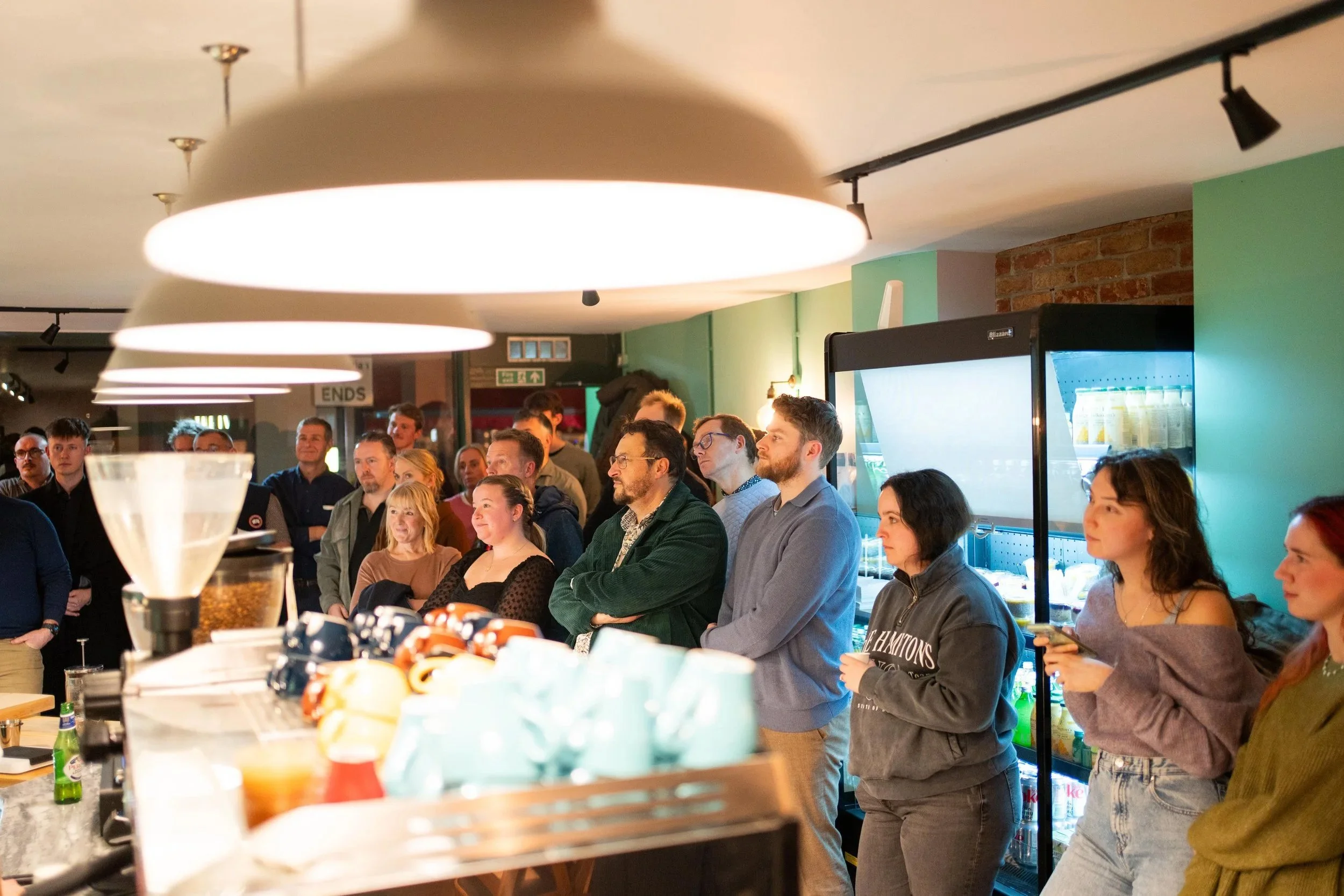
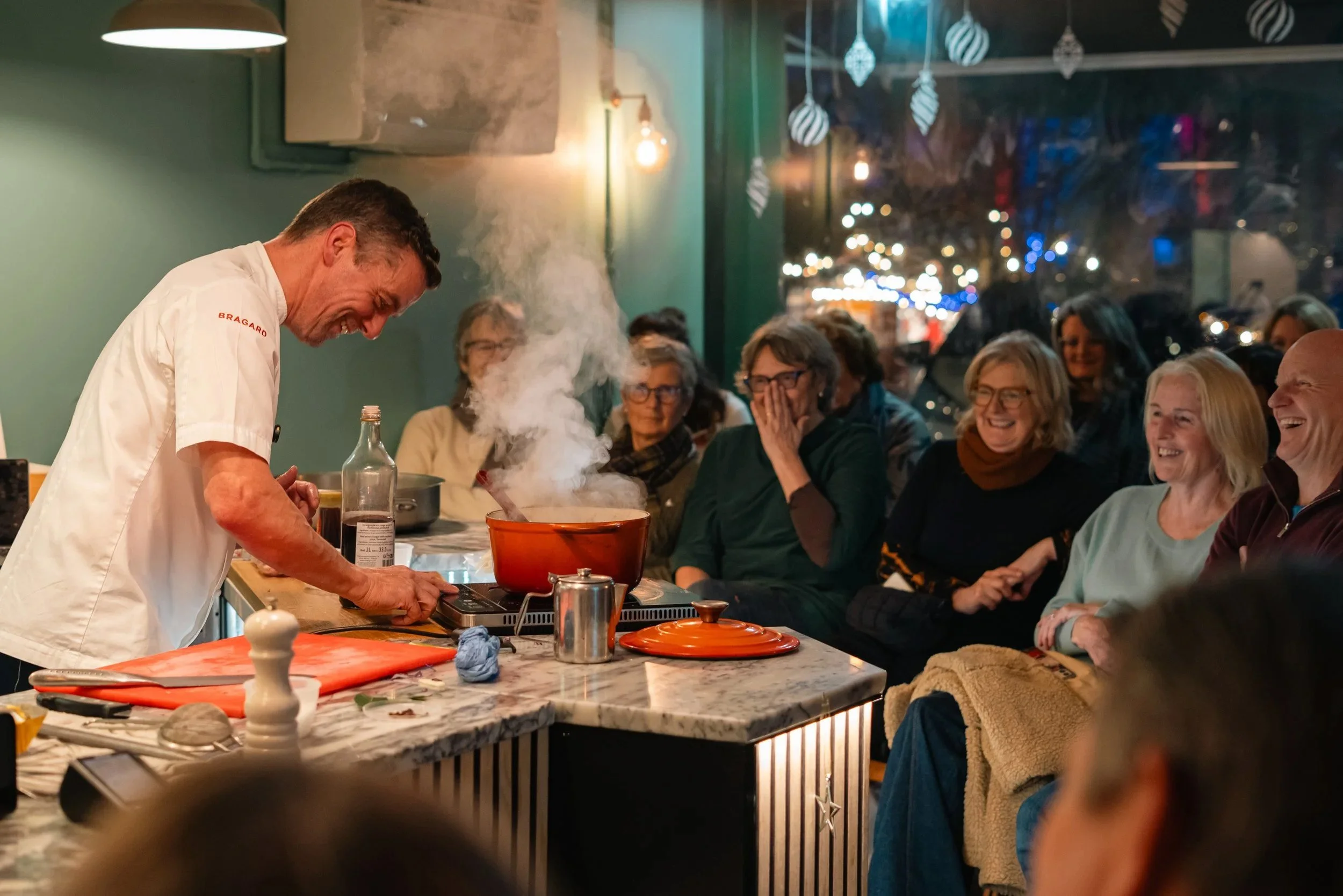
"Social" became central to the brand, shaping everything from the customer experience to a programme of monthly events featuring local creatives, specialists and makers.
From Christmas cooking masterclasses with Steve himself to talks from local historians, vinyl experts and guest mixologists, each event celebrated craftsmanship and brought Guildford's creative scene together.
Visual Identity
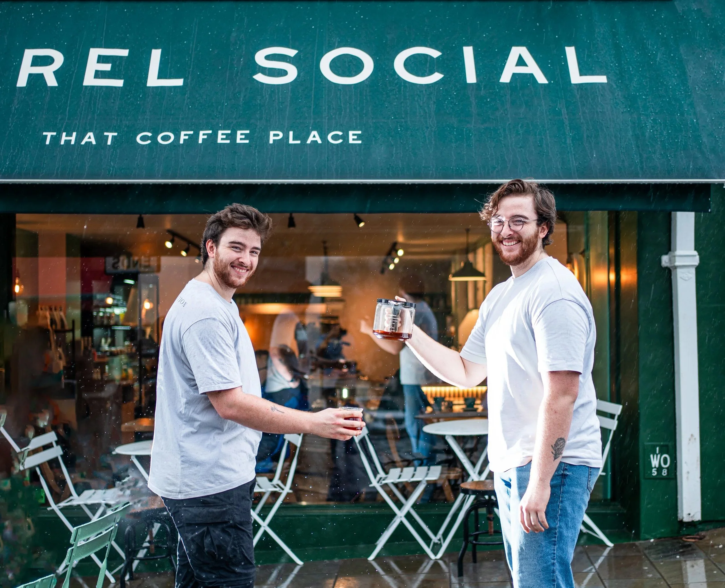
We created a brand that felt crafted and contemporary, while remaining approachable and inclusive.
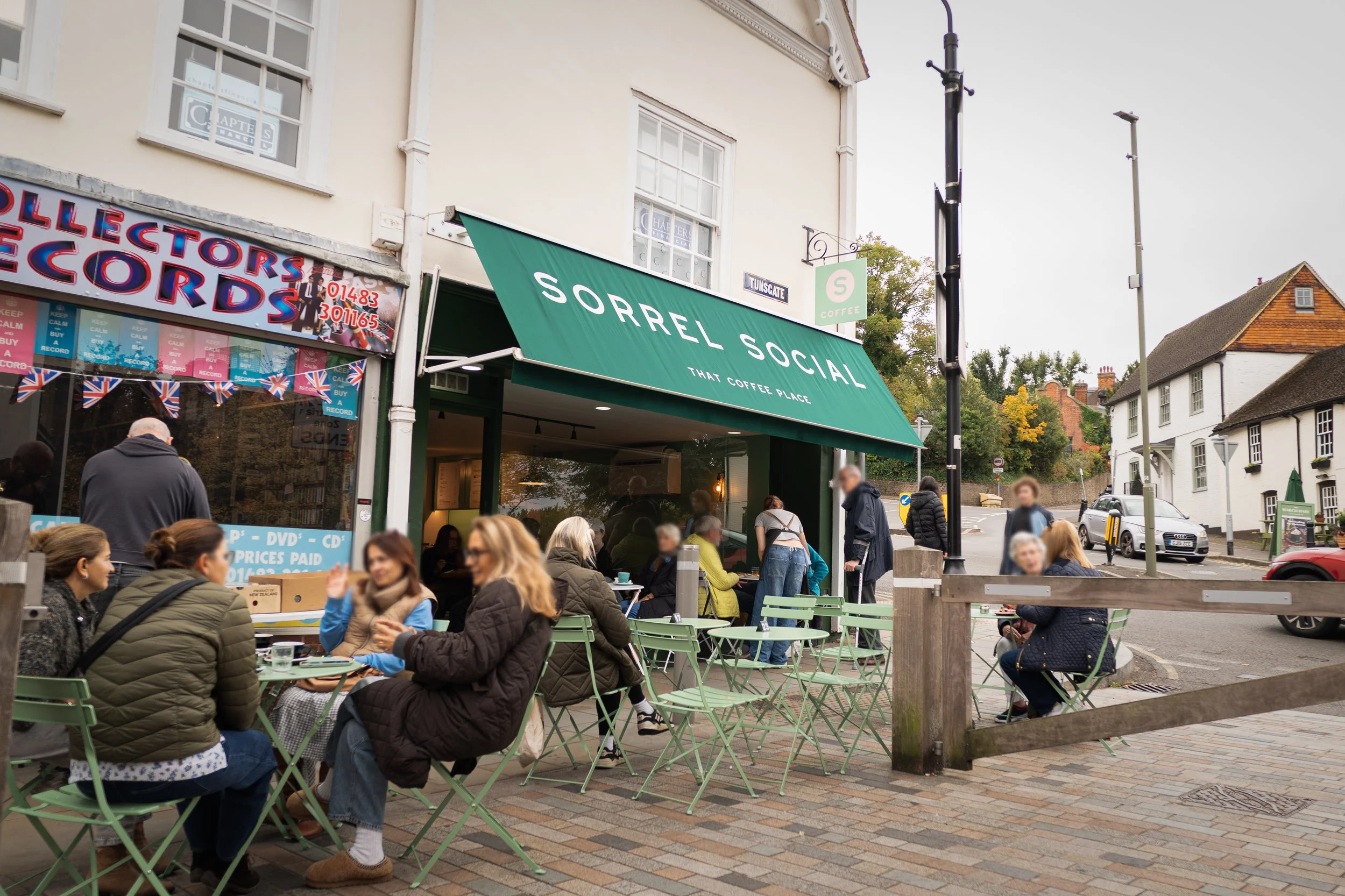
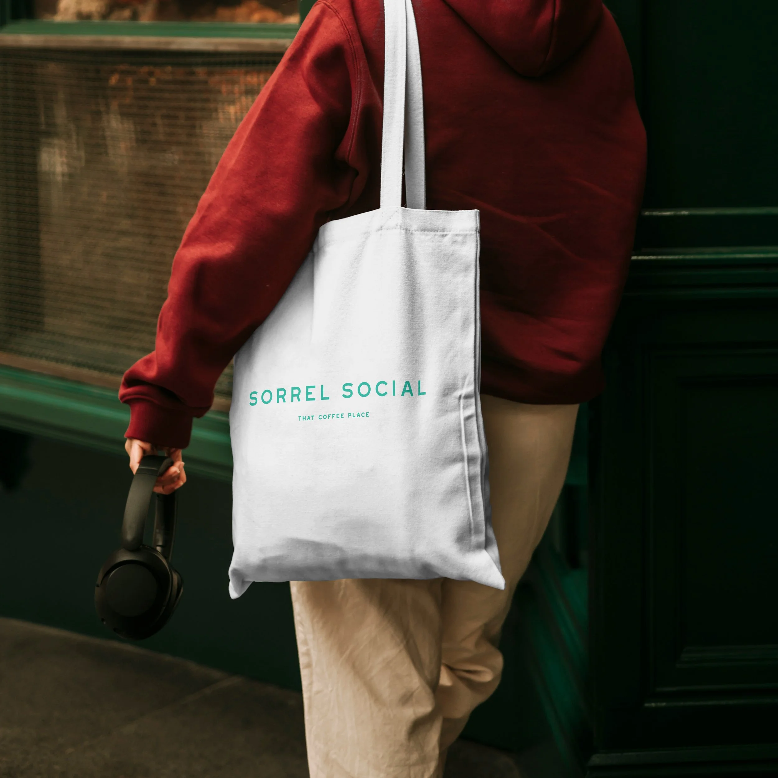
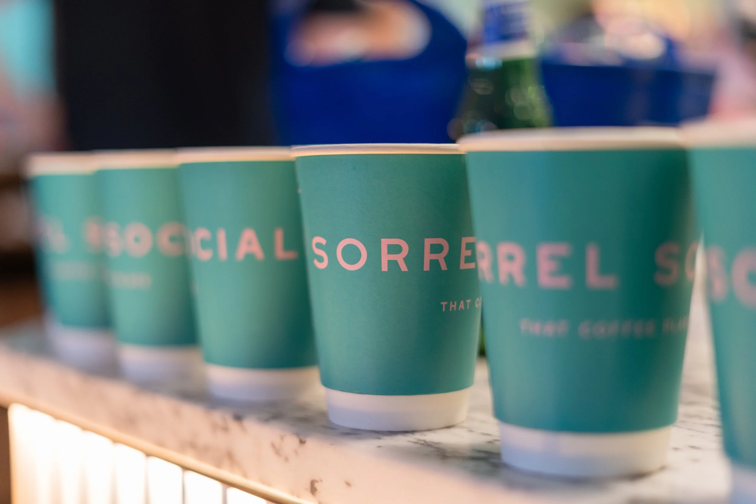
A clean sans-serif typographic system was paired with a bold green palette to convey confidence, while playful pink accents added warmth and personality.
The tone deliberately avoided Michelin-level formality, instead feeling familiar and welcoming. The strapline, "That coffee place", grounded the brand in the language of everyday local life.
“Sorrel Social is all about bringing people together with the common goal of drinking great coffee. The rebrand has been a huge success with incredible customer feedback. People love the branding, the openness, and our friendly approach to customer service.”
Steve Drake